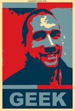
The Man of WIRED
WIRED was started in 1993...the magazine and the website were started concurrently. They're a rarity in that and the first to champion digital. What they're LESS proud of is being the inventor of the banner ad...*cue multiple boos*. (Sorry about that) They are the informational voice that talks about the way the world is changing...at least technologically.
In 1993, Dadich was a junior in high school...Jurassic Park was the #1 film, Windows NT, and the entirety of the Internet fit on 50 servers. Today, Star Wars The Force Awakens topped 2 billion, 1 in 7 humans log into Facebook EVERY DAY, YouTube reaches more adults than cable TV, and Microsoft is a service company and a hardware company...oh, and Apple's Market value = > 500 billion. WIRED always set out to feel like a letter written back from the future. 20 years, let's say...but now, what used to take 20 years to happen happens in about 20 months.
What Is Design?
Everyone knows it...but knows their own. Scott uses the Wright Brothers to illustrate design: Everyone thinks they designed flight. No. There were several flying machines before them. They designed the human control element that allowed it to happen. They brought it into the realm of human control.
What choices do we have when we design? Red/blue, steel/spruce, Python/ruby...these are all design questions. So, in some sense, we are all designers. We are designing all the time. Design makes things work...
Design is decision-making.
Decision upon decision ultimately builds, creates, or just plain MAKES something.
And sometimes...it's important to make the WRONG decision.
Scott's Early Days
He started as a Creative Director for WIRED and was hired by a guy named Chris. One of the things Chris wanted to do was to make the magazine "grow up". The challenge, then, was to remodel WIRED for a modern context. What he did was back into the component parts to understand how every little piece was built on a very common element: The pixel. The logo represented binary (on/off/on/off) as well as the vibrations through the spine. And, guess what? Scott wasn't allowed to change the logo or the spine vibe.
So, Scott had a typeface created (a slab serif), went a bit more "Mad Men", a more monochromatic feel...and he was told to add more color. Pissed, he walked away and found the gnarliest colors (safety cone orange) and added one square. One. And it was awful...
...but it drew attention to what was RIGHT with the design. How SO MUCH ELSE was right. So, next issue he went with a big RED stripe...the following he started pitting artist against artist, trying to actually make it NOT right/work. Three-ish years later, they had come up with something...all through the "wrong" decision/design. Present day, the spine (among so much else) has changed significantly.
The Wrong Theory and Wrong Theory Decisions
This concept has been there all along, despite Scott thinking he had actually come up with. John Rand in 1841 came up with incredible new hues through chemistry, etc...and out of it came Impressionism. Degas is another prime example: The pole in the middle his impressionist work with the horse/jockey...it was RIDICULED. But then? You begin to see it (the line element) being used more and more and more.
Stravinsky in 1913 wanted to debut a piece featuring strings syncopating with winds, but also kettle drums playing counter to it. By the second act of its debut, there was a riot in the theatre...they ejected 46 people, there were fights, etc. A year later? Biggest hit ever. And the piece was rhythms and melodies from popular folk tunes layered over each other. It built on what people knew, then made a considered choice.
Stravinsky was one of the first remix artists. Boom.
Miles Davis (Bitches Brew) and The Sopranos...also examples. They all understood the rules and made a calculated decision. It wasn't about ignoring the rules. It was about becoming an expert within the rules BEFORE making exceptions to them. Wrong Theory is Experimentation, Build Consensus, Find Perfection, then Ruin It. Crazy. But, if it feels bad, you're probably on your way to something new...wrong, right, or otherwise. Design is not just about making something beautiful...it's about making something work.
(Got sidetracked listening, sorry...amazing stuff, one of the best examples being how similar our online experience is (Apple, Google, and Microsoft's native font is nearly identical) compared to how divergent the PC/iMAC situation was)
SimCity, Upsilon Circuit, Netflix...ALL playing with Wrong Decisions...and it WORKS. In cars, Volvo makes a car JUST FOR RIDE SHARING...the one decision being taking out the front seat. 3D Printing...just a plastic spitting machine which now has been, for lack of a better term, reverse engineered. Even our home furnishing...we're seeing it EVERYWHERE.
Find Your Orange Bar...Go Make Something Perfect...and Ruin It
I have always been risk averse for the sake of not "ruining/changing" something that works. This talk has definitely, at minimum, started my considering of changing that thought process. I'm hoping that I can go back to my current situation (which is chock full of change) and actually take it and ruin it for the better...I can only hope.
Subscribe to:
Post Comments (Atom)


No comments:
Post a Comment